Descriptive Statistics
In Descriptive statistics, We can describe our data in some manner and present it in a meaningful way so that it can be easily understood e.g. charts, graphs, tables, excel files, etc. Most of the time it is performed on small data sets and this analysis helps us a lot to predict some future trends based on the current findings. Some measures that are used to describe a data set are measures of central tendency and measures of variability or dispersion.
Let’s one by one we will learn key measures in descriptive statistics :
import pandas as pd
import numpy as np
import matplotlib.pyplot as plt
import seaborn as sns

# Sample dataset
data = pd.DataFrame({
    'Age': [25, 30, 40, 42, 50, 55, 60, 65, 68,70],
    'Income': [3000, 3200, 3400, 3800, 4200, 5000, 5200, 5500, 6000, 6500]
})
1. Measures of Central Tendency:
Mean: The average value of the data.
Median: The middle value when data is sorted.
Mode: The most frequent value in the dataset.
#Mean
mean_age = data['Age'].mean()
print(f"Mean Age: {mean_age}")            #Output : Mean Age: 50.5

#Median
median_income = data['Income'].median()
print(f"Median Income: {median_income}")  #Output : Median Income: 4600.0

#Mode
mode_age = data['Age'].mode()[0]
print(f"Mode Age: {mode_age}")            #Output : Mode Age: 25
2. Measures of Dispersion:
Range: Difference between the maximum and minimum values.
Variance: Average squared deviation from the mean.
Standard Deviation: Square root of variance, representing data spread.
range_age = data['Age'].max() - data['Age'].min()
print(f"Range of Age: {range_age}")                      #Output : Range of Age: 45

variance_income = data['Income'].var()
std_dev_income = data['Income'].std()
print(f"Variance of Income: {variance_income}")          #Output : Variance of Income: 1517333.3333333333
print(f"Standard Deviation of Income: {std_dev_income}") #Output : Standard Deviation of Income: 1231.8008497047456
Let’s check the distribution of data in graphical form by using Histogram and boxplot :
plt.hist(data['Age'], bins=5, color='skyblue', edgecolor='black')
plt.title("Age Distribution")
plt.xlabel("Age")
plt.ylabel("Frequency")
plt.show()

sns.boxplot(data['Income'])
plt.title("Income Distribution")
plt.show()

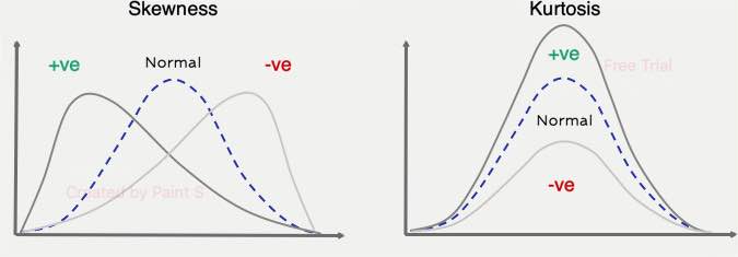
3. Measures of Shapes :
Skewness: It indicates asymmetry in the distribution. which helps us to identify whether the data leans more towards one side of the mean
Kurtosis: It measures the “tailedness” of the distribution. which indicates the frequency and severity of outliers.
from scipy.stats import skew

skewness_age = skew(data['Age'])
print(f"Skewness of Age: {skewness_age}")           #Output= Skewness of Age: -0.3000306702932297


from scipy.stats import kurtosis

kurtosis_income = kurtosis(data['Income'])
print(f"Kurtosis of Income: {kurtosis_income}")     #Output= Kurtosis of Income: -1.3516637272555991